I have created a new blog today with the hopes of providing some progress after recently discovering my enjoyment with 3D work again.
I have a bit of information about what I've done since my last post on this blog, as well as what I plan to do in the near future.
See you there, hopefully!
The new blog is: http://tomrobinsonart.blogspot.co.uk/
Thursday, 30 July 2015
Sunday, 5 May 2013
Update: 05/05/2013
The much awaited update...
It's been one hell of a long time since I last updated the blog; things suddenly started moving quite quickly and the deadline for my Advanced Game Development, Concept Art and Contemporary Studies have all been and gone - successfully for the most part - leaving just my Final Year Project to go. The deadline for this project is Tuesday May 14th, so I have just over a week to go and I'm pretty content with how things are going. It's easy to say in hindsight, but I'd love to have focused on this a lot more than I did but not to worry.
I'll cut straight to the chase and show you two screenshots of my environment in it's current state:


As you can see there have been a lot of new additions made and the whole piece is look a lot more, not complete but, on-the-way. It's too much to say exactly what I've added but it's a lot of important bits as well as a lot of filler assets. I still have the security console - the untextured asset in the centre - to complete and sort out what I'm doing with the door but other than that I'm pleased with it.
I have a dissertation to do which I am starting tomorrow and plan to have a sizable amount of it done on Thursday when I have a meeting with Shaf, my module tutor, to discuss how the dissertation is going so far. Once I have the dissertation done I should have a few days left to polish everything and make any final adjustments before the deadline.
More to come!
Wednesday, 27 February 2013
Things so far...
Recent Addition
I just wanted to make a quick up-date to show the current state of my environment. I've not got as much done in recent times as I would have liked but I've been busy in other areas of university work as well.
Its taken a while but I've finally got my preliminary version of my doors into the scene, along with the basic shape I'll be using for the doorway itself.
I need to do some more work on the doors, including making the final texture and sorting out the peculiar shading errors on it and its a similar story for the doorway; making a final model along with some nice detail and a texture.
An Overview


Here is the environment so far; still plenty of work to be done but its beginning to take shape and I have a solid idea of the direction I wish to press on with. I just have to make sure that I keep on top of my other modules as well and do not let myself run off too far with this.
More to come soon!
I just wanted to make a quick up-date to show the current state of my environment. I've not got as much done in recent times as I would have liked but I've been busy in other areas of university work as well.
Its taken a while but I've finally got my preliminary version of my doors into the scene, along with the basic shape I'll be using for the doorway itself.
 |
| The preliminary door and doorway. |
An Overview


Here is the environment so far; still plenty of work to be done but its beginning to take shape and I have a solid idea of the direction I wish to press on with. I just have to make sure that I keep on top of my other modules as well and do not let myself run off too far with this.
More to come soon!
Thursday, 14 February 2013
Pay Attention!
Had some trouble with the scale again recently. At some point my 'game type' inside UDK must have been reset and this led to my camera height being much higher than the standard 96uu it is supposed to be. This in turn with my recent up scaling of the walls, as they seemed too short, meant that when I put my camera back to the right position the scene was way too big.
 |
| With the camera changed back the office looked more like a small warehouse. |
I should have noticed much sooner as the walls were 12ft high at this point and should have seemed much bigger in comparison to my camera. I changed the walls back to the original 10ft height and took the opportunity to change the dimensions one last time; the final size being 40x20x10.
 | |||
| With the modular pieces resized it looked much better, no more changes from now on! |
I will post an image of the environments current stage in the near future. At this point I was testing out the emissive lighting from the holo-screen but have added some proper lights since then which gives the room a much calmer glow to it.
The Holographic Material
Inspiration
As well as the concept art from Deus Ex: Human Revolution I was also looking at my favourite sci-fi universe from the Mass Effect series as a source of inspiration. The art style in the game is truly impressive and I've spent countless hours lost in it.
One of the key pieces in the concept piece was the number of different screens there is throughout the environment; a main tv, a computer screen, a tablet, security monitors and so on. I knew that these would be one of the most eye catching features in my environment and I wanted to make sure they were worthy of that.
I set about planning on how I could go about doing this and settled on the idea of having the screens be holographic interfaces. These interfaces would be projected onto a glass-like material and then pop-out to become touch-screen enabled.
Creation
I began testing a holographic material inside UDK using a simple logo to test out what it would eventually look like and once I was happy with that I went into 3DS Max and began creating a preliminary design for my holographic screen - it is still in use in the current build of my environment as I want to get more important aspects completed before I go back to it. I then went into Photoshop and began creating my own interface. It took about half an hour and uses I am use white for everything that I want to show up and black for the background; this will make UDK show everything in white but make all the black invisible.
You may have noticed there are some empty boxes within the texture. To have any animated parts of your texture you need to ensure they are separated from the base texture - otherwise the animation you put on it will move the entire thing! I used the RGB channels in a separate texture and used these to hold: an email icon, this will be flashing in the left portion of the circle; an amount of text, this will scroll in the box at the bottom; and a mask for the text box, this will ensure that the scrolling text does not appear outside the box.
It looks like a bit of a colourful jumble from this image but when it is in the material editor I will use the R, G and B channels individually to select the bits of information and they will come out as white, ready for a new colour to be assigned.
With my texture ready I set about creating my material inside UDK which took around 20 minutes. After it was created I had a look around Polycount and other websites to see if anyone has any useful tips on things like this for improving their visual effect - the main addition being a small gradient that follows the camera which gives the illusion of light reflecting off the glass material underneath the hologram.
With the material created I then imported the static mesh of my place holder screen and applied it to see how it looked.
As I previously mentioned there is a lot more I want to do with the holographic screens;
creating new materials and models for it to add variation but also to refine this even more. I will come back to it soon but first I want to get more added to my environment to ensure that I keep on top of the work load.
Thanks for reading!
As well as the concept art from Deus Ex: Human Revolution I was also looking at my favourite sci-fi universe from the Mass Effect series as a source of inspiration. The art style in the game is truly impressive and I've spent countless hours lost in it.
One of the key pieces in the concept piece was the number of different screens there is throughout the environment; a main tv, a computer screen, a tablet, security monitors and so on. I knew that these would be one of the most eye catching features in my environment and I wanted to make sure they were worthy of that.
I set about planning on how I could go about doing this and settled on the idea of having the screens be holographic interfaces. These interfaces would be projected onto a glass-like material and then pop-out to become touch-screen enabled.
Creation
I began testing a holographic material inside UDK using a simple logo to test out what it would eventually look like and once I was happy with that I went into 3DS Max and began creating a preliminary design for my holographic screen - it is still in use in the current build of my environment as I want to get more important aspects completed before I go back to it. I then went into Photoshop and began creating my own interface. It took about half an hour and uses I am use white for everything that I want to show up and black for the background; this will make UDK show everything in white but make all the black invisible.
 |
| The preliminary diffuse texture for my holographic screen. |
You may have noticed there are some empty boxes within the texture. To have any animated parts of your texture you need to ensure they are separated from the base texture - otherwise the animation you put on it will move the entire thing! I used the RGB channels in a separate texture and used these to hold: an email icon, this will be flashing in the left portion of the circle; an amount of text, this will scroll in the box at the bottom; and a mask for the text box, this will ensure that the scrolling text does not appear outside the box.
 |
| The alpha mask used in my holographic material. |
With my texture ready I set about creating my material inside UDK which took around 20 minutes. After it was created I had a look around Polycount and other websites to see if anyone has any useful tips on things like this for improving their visual effect - the main addition being a small gradient that follows the camera which gives the illusion of light reflecting off the glass material underneath the hologram.
 |
| The current material in all it's glory. |
 |
| The place holder holographic screen in my current environment build. |
creating new materials and models for it to add variation but also to refine this even more. I will come back to it soon but first I want to get more added to my environment to ensure that I keep on top of the work load.
Thanks for reading!
Tuesday, 12 February 2013
Modularity in action
I wanted to add these images
so you can see what the environment was like with the modular walls and
floor panels in place. It also gives an indication of the scale of the
room at this stage of development.


It is important to add that these images are from before I increased the dimensions by 4ft in length and 2ft in height: the current dimensions are 48x24x12.
I will post a screenshot of the environment in it's current state after the next post.


It is important to add that these images are from before I increased the dimensions by 4ft in length and 2ft in height: the current dimensions are 48x24x12.
I will post a screenshot of the environment in it's current state after the next post.
Modularity
The Logic
Making use of modular assets was my main aim for the get go when it came to creating the walls, floor and ceiling of my environment. It is used extensively in all games these days, and for good reason too. It allows you to spend your time wisely creating a detailed, well-textured model instead of hurriedly creating many different variations. Once you have this model and export it into your engine you can add as many iterations into your environment as needed allowing you to quickly piece it together.
It helps to have equal sized modular pieces (2x2, 4x4, etc.) as they are easier to piece together once inside your engine, although they are not a necessity. With my level dimensions at 24x44x10 I worked out that I need to create a floor tile of 12x11 and I had hoped to create a single wall panel but realised at 24x44 I could not use one model properly with the length and width I had set up. I needed to create two panels - one at 12x10 and one at 11x10; the 12x10s would be used twice on each end to make a 22x10 wall and the 11x10s four times to make a 44x10 wall at each side.
As I mentioned earlier it would have been much easier to have equally sized proportions for my modular pieces as they would have snapped together easier, but after testing out all my blockouts I didn't feel I couldn't accommodate an appropriately sized environment for them. After adding some more models to my environment, and understanding I could be a little looser with following the concept, I changed the dimensions so they were suitable for square modular pieces.
The Models
I began researching some examples of sci fi-themed walls and floors on sites like Polycount and viewing what Google Images had to offer. They gave me some inspiration and I drew some quick illustrations of some potential designs. I began creating the modular wall in 3DS Max where I created a high poly model, before baking a normal map to project the detail onto a lower poly model. I then created a texture for it in Photoshop before taking it into UDK to see what it looked like inside the engine. It took me three attempts before I was finally happy with a wall and after the first I changed my work flow.

My lack of experince in high poly modelling became apparent here as I had some trouble with getting things to look right once a turbosmooth was applied. The idea was to add various indents to the wall as well as some grills/vents in the bevels at the side but it took far too long to get them modelled in and eventually I scrapped them just to make sure I got something into the engine. It looks very average and the test-texture on it doesn't help.

As you can see I recreated the original design, giving it a more refined look and even managed to include the vents which I had been unable to before. The difference this time was that instead of creating a high poly model in 3DS Max, I used the nDo2 plug in with Photoshop to create a normal map before importing it into UDK.
I was amazed at how much quicker it was - it took me 20 minutes to create this, compared to 3 hours for the first wall. I was happy with the design but I knew the texture needed some work, however when I tested it out in UDK I found that the vents I added were far too repetitive for it to been used convincingly in a modular environment.

I started from scratch with nDo2 and created the third and final wall panel, getting rid of the vents to ensure it looked good when used modularly. I also completely redid the texture which I am much happier with and did some more research into creating convincing materials. It is hard to tell from this one but it has a very nice shine to it and has a preliminary reflection map on it which really sells the metal effect.

It was a similar story for the floor tiles. These were created from high poly models in 3DS Max and, coupled with the first attempt at the texture yielded very underwhelming results.
For the final floor panel I switched to creating it in nDo2 which wound up being quicker but also yielding a much better result.

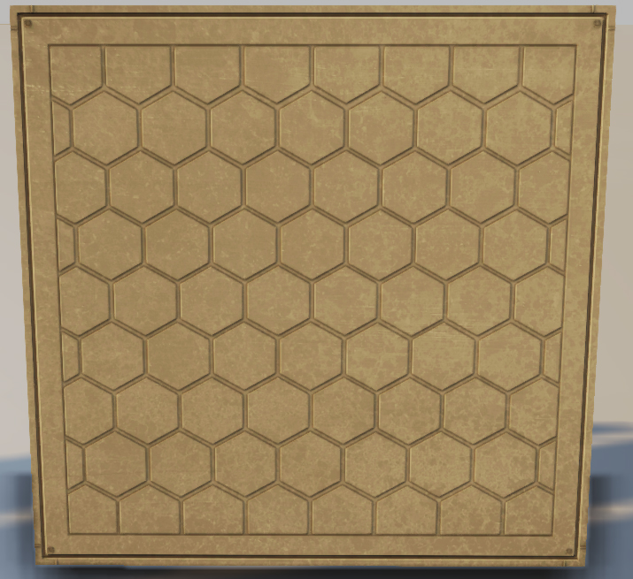
Whilst I was browsing Google Images
I stumbled upon a background which had a honeycomb effect on it which
looked really nice and gave a great futuristic vibe. I thought it would
work really well on my floor panel and I wasn't disappointed. As
well as the new normal map I also created a new texture using similar
elements to the walls and popped the metallic material I created on it
as well. Similarly to the final wall piece you can't see the effect of
the material on this until you actually see it in the environment but
it's safe to say I'm really pleased with it.
EDIT: After posting this I have realised just how much the 'afternoon lighting' in UDK has affected the texture. Its safe to say they look nowhere near as yellow in the environment; I'll post a proper photo of it so far in the next entry!
Making use of modular assets was my main aim for the get go when it came to creating the walls, floor and ceiling of my environment. It is used extensively in all games these days, and for good reason too. It allows you to spend your time wisely creating a detailed, well-textured model instead of hurriedly creating many different variations. Once you have this model and export it into your engine you can add as many iterations into your environment as needed allowing you to quickly piece it together.
It helps to have equal sized modular pieces (2x2, 4x4, etc.) as they are easier to piece together once inside your engine, although they are not a necessity. With my level dimensions at 24x44x10 I worked out that I need to create a floor tile of 12x11 and I had hoped to create a single wall panel but realised at 24x44 I could not use one model properly with the length and width I had set up. I needed to create two panels - one at 12x10 and one at 11x10; the 12x10s would be used twice on each end to make a 22x10 wall and the 11x10s four times to make a 44x10 wall at each side.
As I mentioned earlier it would have been much easier to have equally sized proportions for my modular pieces as they would have snapped together easier, but after testing out all my blockouts I didn't feel I couldn't accommodate an appropriately sized environment for them. After adding some more models to my environment, and understanding I could be a little looser with following the concept, I changed the dimensions so they were suitable for square modular pieces.
The Models
I began researching some examples of sci fi-themed walls and floors on sites like Polycount and viewing what Google Images had to offer. They gave me some inspiration and I drew some quick illustrations of some potential designs. I began creating the modular wall in 3DS Max where I created a high poly model, before baking a normal map to project the detail onto a lower poly model. I then created a texture for it in Photoshop before taking it into UDK to see what it looked like inside the engine. It took me three attempts before I was finally happy with a wall and after the first I changed my work flow.
Wall 1

My lack of experince in high poly modelling became apparent here as I had some trouble with getting things to look right once a turbosmooth was applied. The idea was to add various indents to the wall as well as some grills/vents in the bevels at the side but it took far too long to get them modelled in and eventually I scrapped them just to make sure I got something into the engine. It looks very average and the test-texture on it doesn't help.
Wall 2

As you can see I recreated the original design, giving it a more refined look and even managed to include the vents which I had been unable to before. The difference this time was that instead of creating a high poly model in 3DS Max, I used the nDo2 plug in with Photoshop to create a normal map before importing it into UDK.
I was amazed at how much quicker it was - it took me 20 minutes to create this, compared to 3 hours for the first wall. I was happy with the design but I knew the texture needed some work, however when I tested it out in UDK I found that the vents I added were far too repetitive for it to been used convincingly in a modular environment.
Wall 3

I started from scratch with nDo2 and created the third and final wall panel, getting rid of the vents to ensure it looked good when used modularly. I also completely redid the texture which I am much happier with and did some more research into creating convincing materials. It is hard to tell from this one but it has a very nice shine to it and has a preliminary reflection map on it which really sells the metal effect.
The Floor Panels

It was a similar story for the floor tiles. These were created from high poly models in 3DS Max and, coupled with the first attempt at the texture yielded very underwhelming results.
For the final floor panel I switched to creating it in nDo2 which wound up being quicker but also yielding a much better result.
EDIT: After posting this I have realised just how much the 'afternoon lighting' in UDK has affected the texture. Its safe to say they look nowhere near as yellow in the environment; I'll post a proper photo of it so far in the next entry!
Subscribe to:
Comments (Atom)